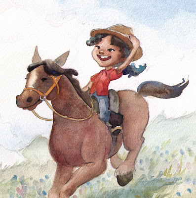
Hello there, blog readers! My blog has been dead for a while. I've been busy illustrating this cute little tale written by Joel Clauberg. It will be published soon! I will give follow up details. Until then, I've been given permission to show my favorite pages. I hope you like it!
Showing posts with label children's book illustration. Show all posts
Sunday, July 7, 2013
Friday, October 21, 2011
Illustration Friday - Fuel
I took a much needed day off today. I had THE perfect day. I slept in until 12:30. Then my husband and I took the dogs to Red Bud Isle dog park, where I sketched and sketched as dogs played around me. Then we went to a fruit stand and I ate mangoes till my belly was distended. Then I took a 2-hour nap. Then I did a 30 minute workout video, then had a big dinner of pasta, caramelized onion, pesto, and kale shreds. Then I painted this for Illustration Friday. Food is a body's fuel!! Anyway, I feel awesome.
I know my painting is a big kerplosion of color. Is it cheesy in the way Rainbow Brite is cheesy?? (I loved Rainbow Brite as a kid. I think she's cool.) Maybe it is... I hadn't touched my watercolor paints in so long I wanted to use every color!
Have a nice day.
Tiff
Monday, March 7, 2011
Portfolio Rebuild Part 1
LATEST UPDATE-----
OK I think this is the last update unless someone has anything glaring to critique I added the dark rocks on the lower left to solidify the composition, but kept it far enough away so there's room for text. Thanks for the suggestion, Matthew! I think this is the limit of my skill level at this point in time. Please stay tuned for part 2 of my portfolio rebuild!! (I'm hoping to get 10 pieces by december 31st, then I'll be ready to beg some publishers to work with me) :) Thanks all for the help! If you have ANYTHING more to say, please critique. I may not post it up here, but I will still consider any suggestions. If anything, it will give me things to look out for in the future.
*OLD POST--------------------
UPDATE!! Adding more darks (darker rocks) really helps! It feels more finished. I added more horse rump form, added an eye sparkle, and added the saturation back in. Does this look ok? Thanks again from the bottom of my heart for the helpful suggestions.
*OLD POST BELOW-------
I'm rebuilding my children's book portfolio from the ground up this year. My portfolio last year lacked finesse and focus, and so, taking some constructive criticism from some people from the children's book illustration meetings, I've decided to completely redo my portfolio. Anyway, this is my first try since going to the meetings. Tell me, can you see this image in a children's book? What would you do to improve it?
and here's a bit of detail:
I'm really looking forward to hearing some constructive criticism.
With the few critiques I just got, thought I would try some quick changes to see how things read. Wow, flipping the image looks weird to me. Possibly because I'm so used to seeing it the way I had it originally. Does this look weird to you too? Also, I applied an auto-levels to the image. I worried before that the saturation makes it hard on the eyes, which is why i toned it down in photoshop. I have one of those stupid monitors that changes the value depending on the angle you're looking at it, So I'm never quite sure what you out there are seeing.
Thanks in advance,
Tiffanny
OK I think this is the last update unless someone has anything glaring to critique I added the dark rocks on the lower left to solidify the composition, but kept it far enough away so there's room for text. Thanks for the suggestion, Matthew! I think this is the limit of my skill level at this point in time. Please stay tuned for part 2 of my portfolio rebuild!! (I'm hoping to get 10 pieces by december 31st, then I'll be ready to beg some publishers to work with me) :) Thanks all for the help! If you have ANYTHING more to say, please critique. I may not post it up here, but I will still consider any suggestions. If anything, it will give me things to look out for in the future.
*OLD POST--------------------
UPDATE!! Adding more darks (darker rocks) really helps! It feels more finished. I added more horse rump form, added an eye sparkle, and added the saturation back in. Does this look ok? Thanks again from the bottom of my heart for the helpful suggestions.
*OLD POST BELOW-------
I'm rebuilding my children's book portfolio from the ground up this year. My portfolio last year lacked finesse and focus, and so, taking some constructive criticism from some people from the children's book illustration meetings, I've decided to completely redo my portfolio. Anyway, this is my first try since going to the meetings. Tell me, can you see this image in a children's book? What would you do to improve it?
and here's a bit of detail:

I'm really looking forward to hearing some constructive criticism.
With the few critiques I just got, thought I would try some quick changes to see how things read. Wow, flipping the image looks weird to me. Possibly because I'm so used to seeing it the way I had it originally. Does this look weird to you too? Also, I applied an auto-levels to the image. I worried before that the saturation makes it hard on the eyes, which is why i toned it down in photoshop. I have one of those stupid monitors that changes the value depending on the angle you're looking at it, So I'm never quite sure what you out there are seeing.
Thanks in advance,
Tiffanny
Subscribe to:
Posts (Atom)


